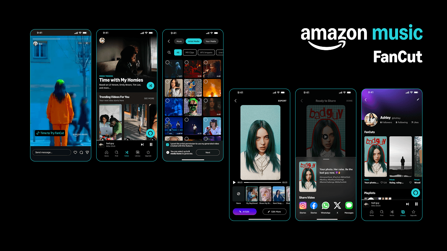
Gutenberg Technology CMS
A usability-driven redesign of an enterprise CMS to improve content structuring, reduce onboarding friction, and support scalable content creation workflows.
Objective
Evaluate and redesign the CMS authoring experience to reduce onboarding friction, clarify content structures, and enable more efficient content creation across users with diverse technical backgrounds.
Role
UX Designer (Research & Systems) Project Manager
Client
Gutenberg Technology
Team
Gloria Y, Atharva N, Grace H, Karla S
Duration
3 months, Sep - Dec 2025
Deliverables
Responsibilities
Led usability testing and eye-tracking studies
Conducted user research and synthesized insights
Designed system-level solutions and interaction flows
Context
An Authoring Tool That Confused Its Own Authors
Gutenberg Technology CMS (GT CMS) is a web-based authoring platform designed for creating structured, content-rich publications through a Table of Contents and modular content blocks.
Despite its powerful capabilities, the onboarding experience created friction for new authors. The issue wasn’t system complexity, but a misalignment between how the system was structured and how users expected it to work. Early interactions required interpretation instead of guidance, leading to hesitation, misreading of content hierarchy, and reliance on trial-and-error.
This project focused on uncovering and resolving that gap, transforming the CMS from a system users had to figure out into one that clearly communicates structure, supports intuitive workflows, and enables confident content creation from the very first interaction.
Solution at a Glance
Designing for Clarity and Confident
I translated behavioral insights into a set of targeted design interventions that clarify structure, reduce early friction, and help authors move forward with confidence.


To understand how I got there, it starts with where the experience was breaking
↓
Define the Problem
What I Learned from the Client
Framing the Challenge
I began by aligning with the Gutenberg Technology team to understand the problem space, constraints, and success criteria. The team had already identified onboarding as a key issue based on user feedback, with an initial assumption that the interface was too complex and needed simplification. However, this had not yet been validated through behavioral research.
From early conversations, I clarified:
Primary focus: New authors onboarding into GT CMS for the first time
Key challenge: Users struggled to set up projects and organize content early in the workflow
Constraint: Solutions needed to work within the existing system, a full redesign was not feasible
Context: The team was preparing for an upcoming authoring flow refactor, making this research high-impact and time-sensitive

Client Kick-Off Meeting: Product Manager Demoing the CMS
These insights led us to a more focused question:
Where and why do new authors lose confidence during onboarding?
Designing for Behavior, Not Just Feedback
The goal was to identify specific moments of friction where users hesitated, misinterpreted the system, or relied on trial-and-error, and understand the underlying reasons.
To capture both behavior and reasoning, I designed a mixed-methods study combining observation, eye-tracking, and post-task reflection. I conducted sessions with first-time GT CMS users to ensure insights reflected true onboarding experiences. While sessions were moderated and task-based, the study was designed to surface natural breakdowns within real workflows.
Because a full system redesign was out of scope, all findings were framed as targeted, actionable improvements within the existing architecture.

Participant is watching his recording and explaining the reasons behind his action
Methods
Moderated Usability Testing (9 Sessions)
Observed how new authors approached project setup and content creation, identifying hesitation, confusion, and repeated actions across key workflows
→ Revealed breakdowns in onboarding, misinterpretation of structure, and reliance on trial-and-error
Tobii Eye-Tracking Analysis
Analyzed gaze pattern, gaze replays, scan paths, areas of interest (AOIs), and heatmaps to understand how users visually navigated the interface
→ Revealed where attention was misdirected, where users expected actions, and where visual hierarchy failed
Retrospective Think-Aloud (RTA)
Captured user reasoning after tasks to uncover gaps between user expectations and system behavior
System Usability Score (SUS)
Measured perceived usability, with a score of 60 (below the industry benchmark of 68), reinforcing behavioral findings of friction and low confidence
Findings & Recommendations
5 Patterns That Broke the Experience
Across 9 sessions, I didn't see isolated usability issues. I uncovered consistent breakdowns between how the system worked and how users expected it to work. These mismatches caused hesitation, trial-and-error behavior, and prevented new authors from forming a clear mental model of the system.
Outcomes & Impact
From Guesswork to Guided Authoring
The redesign fundamentally changed how new authors experience the system, from interpreting how it works to being guided by it.
By making structure visible, interactions explicit, and system behavior easier to understand, the experience shifts from something users must figure out into one that actively guides them.
Projected Behavioral Shifts
Confidence replaces hesitation
Users act with intention instead of second-guessing or relying on trial-and-error
Structure becomes immediately understandable
Authors can clearly distinguish between pages, sections, and templates without needing prior context
Interactions feel predictable and learnable
Previously hidden behaviors become visible through clear affordances and feedback
Onboarding becomes frictionless
New authors move from setup to meaningful content creation without backtracking
Delivering to the Client
I presented all findings and recommendations in a final readout, walking the team through each behavioral breakdown, the supporting evidence, and the reasoning behind each recommendation.
I delivered a complete research package, including the slide deck, session recordings, highlight reels, gaze analysis, and design recommendations, enabling the team to move directly into implementation.
With an upcoming authoring flow refactor already planned, this work provided a clear, evidence-based foundation for prioritizing what to fix and why.
“Great to have a fresh view on something we’re so accustomed to, especially because we’re hoping to refactor our creation flow next year. This is going to be very useful for us for our upcoming work.”
— Gutenberg Technology Team
Reflection
What This Project Taught Me
This project reinforced a key lesson: the gap between how a system works and how users think it works is often invisible from the inside.
The GT team initially framed onboarding friction as a complexity issue. Through behavioral research, I uncovered a deeper problem – a mismatch in mental models. That shift reframed the solution: not simplifying the interface, but clarifying how the system communicates structure, actions, and feedback.
Conducting eye-tracking studies further changed how I approach design. Seeing where users actually focused vs where I assumed they would, revealed how easily visual hierarchy can fail. It pushed me to move beyond assumptions and ground decisions in observable behavior.
If I were to extend this work, I would introduce a longitudinal study to understand how onboarding evolves over time. First-time usability is only part of the experience, a successful authoring tool must remain intuitive and predictable even after repeated use.